Head-to-Head · April 2026
Real Images · Same Prompts
GPT Image 2 vs Nano Banana 2: We Used the Exact Same Prompts on Both. Here’s What Happened.
Five real use cases. Five identical prompts. Two of the best AI image models available right now. The results were more surprising than we expected — not because one model crushed the other, but because they interpreted the same words in completely different ways.
The internet is full of AI image comparisons that tell you almost nothing useful. They pick flattering outputs, cherry-pick edge cases, and end with “it depends.” This isn’t that article.
We took five actual use cases — product mockups, lifestyle photography, infographics, marketing posters, and cinematic mood shots — wrote one specific prompt for each, ran it through both GPT Image 2 and Nano Banana 2 without modification, and compared what came out. The images you see below are the real outputs, unedited.
The verdict isn’t “GPT Image 2 wins” or “Nano Banana 2 wins.” It’s more interesting than that. These two models have meaningfully different aesthetic instincts — and understanding which one matches your use case is worth more than any benchmark score.
MODEL A
GPT Image 2
OpenAI · April 21, 2026
~99% text accuracy
Built-in reasoning (Thinking Mode)
$5/$30 per 1M tokens (API)
MODEL B
Nano Banana 2
Google · Feb 26, 2026
3.75MP resolution
14 aspect ratios · SynthID watermark
Free with Google account
ROUND 01
Marketing Poster — Text Accuracy
The biggest known gap between these models. We deliberately included specific text to stress-test both.
PROMPT (identical for both)
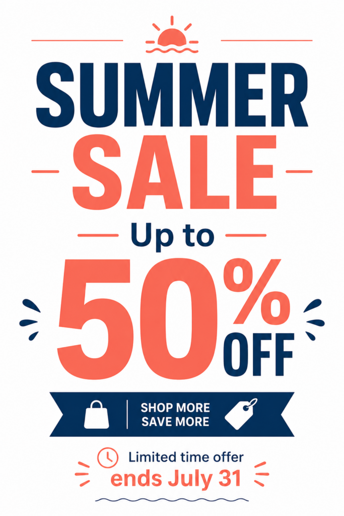
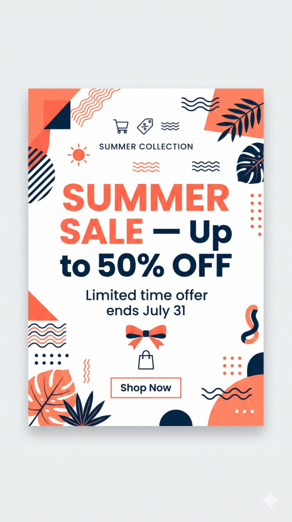
Product launch poster. Bold headline text: “SUMMER SALE — Up to 50% OFF”. Subtext: “Limited time offer ends July 31”. Clean white background, coral and navy color palette, modern sans-serif typography, centered layout, e-commerce style.
The Analysis
GPT IMAGE 2
Typography-first approach. Clean, hierarchical layout. Text is exactly as specified — every word correct, the 50% figure dominant. Added “SHOP MORE SAVE MORE” which wasn’t in the prompt — a confident but opinionated addition.
NANO BANANA 2
Memphis design aesthetic — geometric shapes, tropical leaf motifs, scattered decorative elements. Text is accurate (“SUMMER SALE”, “Up to 50% OFF”, “Limited time offer ends July 31” all correct). More decorative but also more visually noisy.
Verdict:
Both got the text right — GPT Image 2’s ~99% accuracy claim holds up, but so did Nano Banana 2 here. The real difference is aesthetic direction. GPT Image 2 = clean typographic poster. Nano Banana 2 = illustrated graphic design. Pick based on the vibe you need, not text accuracy alone.
ROUND 02
Product Mockup — 3D Object
Product photography is one of the highest-value use cases for AI image generation — replaces expensive studio shoots for e-commerce and DTC brands.
PROMPT (identical for both)
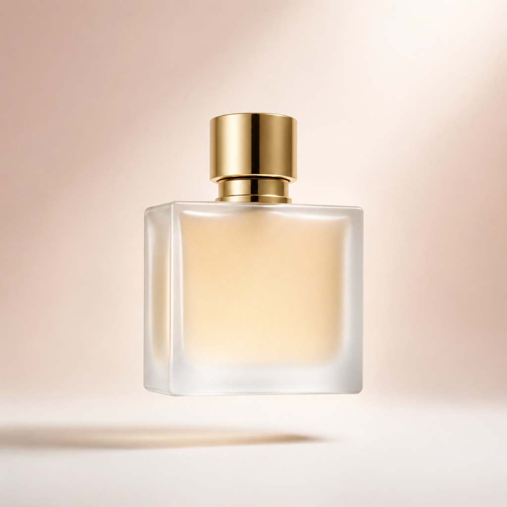
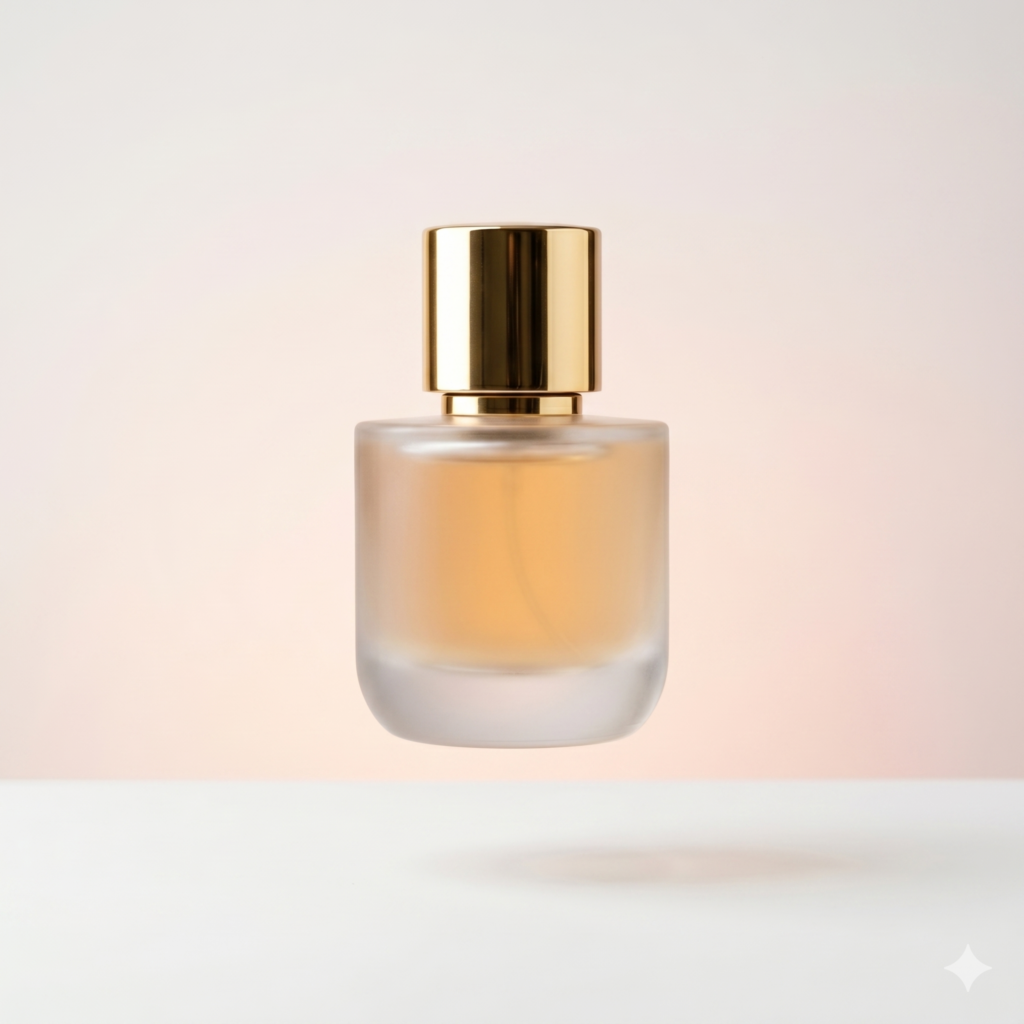
Minimal 3D floating perfume bottle on soft gradient background. Frosted glass texture, gold cap, subtle shadow below. Clean white surface, professional product photography style, no text, centered composition. Aspect ratio 1:1.
The Analysis
GPT IMAGE 2
Square-form bottle with architectural edges. Warmer background gradient. The frosted glass material reads beautifully — you can see the amber liquid inside with genuine translucency. Shadow placement is photorealistic. This looks like it belongs in a Sephora listing.
NANO BANANA 2
Cylindrical bottle — softer, more feminine silhouette. Cooler, more neutral background. The frosted glass is equally convincing. Slightly more minimalist overall, with a subtler gradient that reads more understated luxury. Shadow is softer.
Verdict:
Both are genuinely production-ready. The bottle shape diverged completely from the same prompt — GPT Image 2 went architectural and square, Nano Banana 2 went soft and cylindrical. Neither is “wrong,” but they’re different products. Generate from both and pick the silhouette that fits your brand.
ROUND 03
Lifestyle Flat Lay — SNS Content
The bread and butter of content creators — flat lay photography for Instagram, Pinterest, and editorial use.
PROMPT (identical for both)
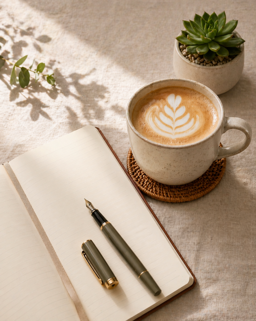
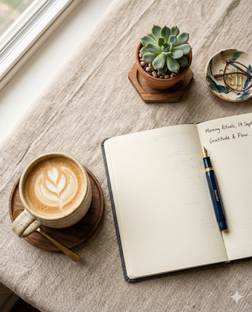
Flat lay photography style. Morning coffee setup: ceramic mug with latte art, open notebook, fountain pen, small succulent plant. Warm neutral tones, soft natural light from left, linen texture surface. Aspect ratio 4:5.
The Analysis
GPT IMAGE 2
Strict side-angle composition rather than a true flat lay. Beautiful details — the handwriting “Morning Rituals, 14 Sept / Gratitude & Flow” in the notebook is an impressive unprompted addition. The ceramic mug latte art is immaculate. But it deviated from “flat lay” into “lifestyle angle.”
NANO BANANA 2
True top-down flat lay. Every requested object is present and correctly positioned. The linen texture is visible. Shadow patterns from a nearby plant add organic detail. The notebook is open and blank — no text added. This is the more literal interpretation of “flat lay photography.”
Verdict:
Nano Banana 2 followed the brief more precisely. GPT Image 2 produced a more editorial result — stunning, but not a flat lay. If you need strict composition compliance, Nano Banana 2. If you want the model to make creative decisions, GPT Image 2.
ROUND 04
Infographic — Object Density & Labels
This is GPT Image 2’s declared strength — 100+ objects in one scene, all correctly rendered. Real test.
PROMPT (identical for both)
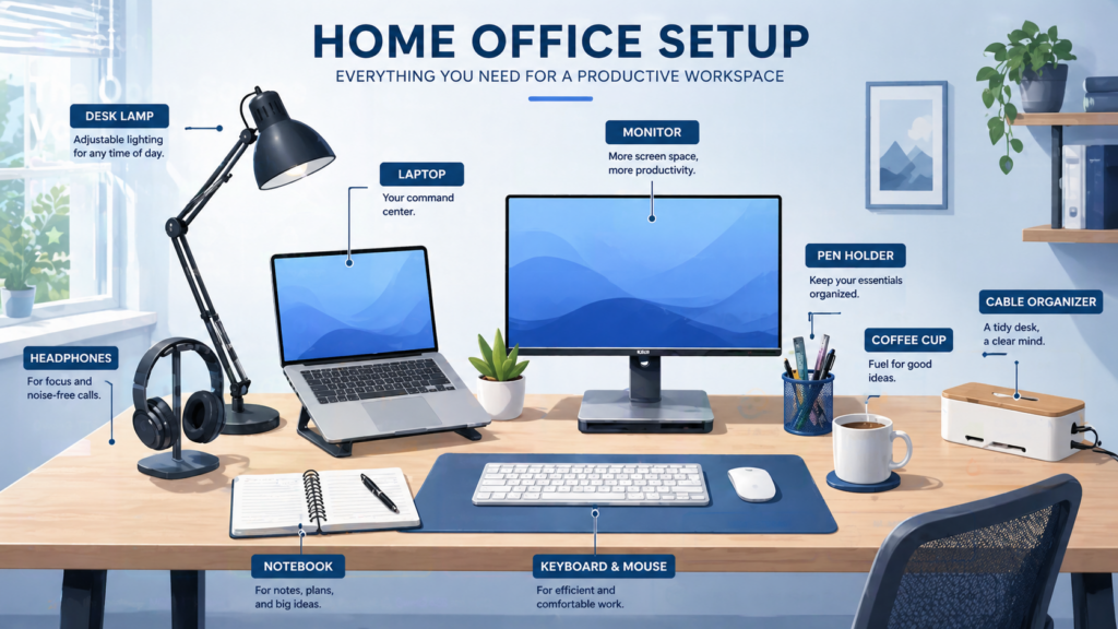
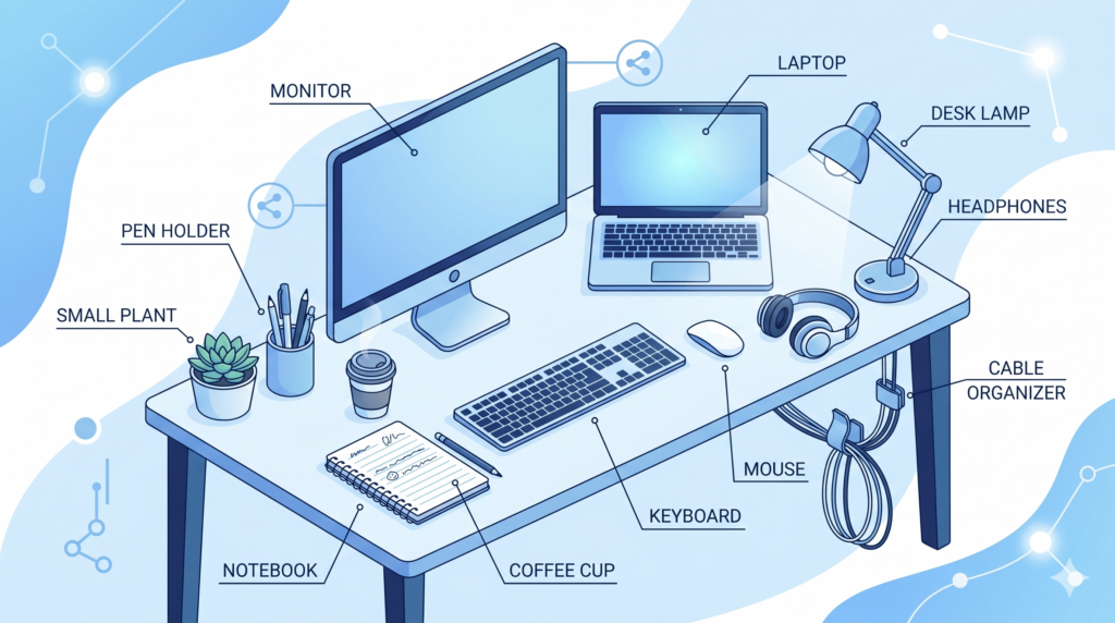
Illustrated infographic-style scene of a home office setup. Desk with laptop, keyboard, mouse, notebook, pen holder, small plant, coffee cup, monitor, headphones, desk lamp, and cable organizer. All items clearly distinct and labeled. Clean vector illustration style, soft blue and white palette. Aspect ratio 16:9.
The Analysis
GPT IMAGE 2
Photo-realistic rendering with detailed labels. Went beyond the brief — added “HOME OFFICE SETUP” headline, descriptive text under each label (“Fuel for good ideas” for coffee cup), and lifestyle context like wall shelving and a chair. Every requested item is present. Information density is exceptional.
NANO BANANA 2
Isometric illustration style — cleaner, more geometric. All requested items present and correctly labeled. The label text is accurate. Decorative network graph elements added to the background (unprompted). More visually consistent with a “vector illustration” aesthetic. Slightly simpler information hierarchy.
Verdict:
Both nailed object count and label accuracy. GPT Image 2 produced a denser, more editorial infographic. Nano Banana 2 stayed truer to the “clean vector illustration” style. GPT Image 2 for information-rich documents. Nano Banana 2 for cleaner, icon-style visuals.
ROUND 05
Cinematic Mood — Style Fidelity
The most subjective round. Atmospheric, editorial photography where “correctness” matters less than feel.
PROMPT (identical for both)
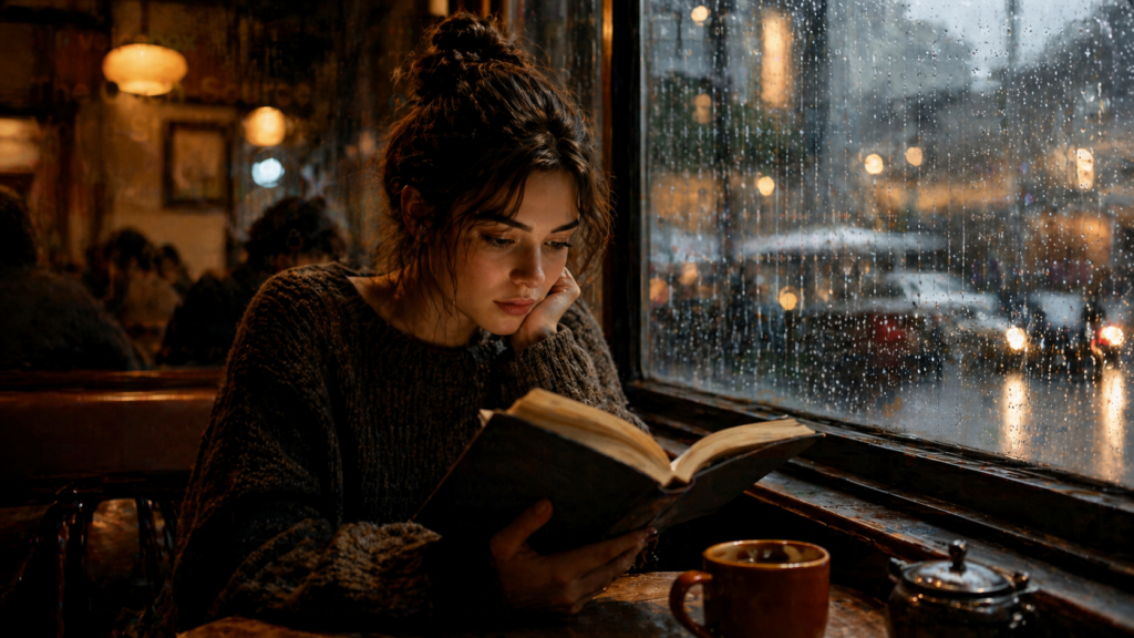
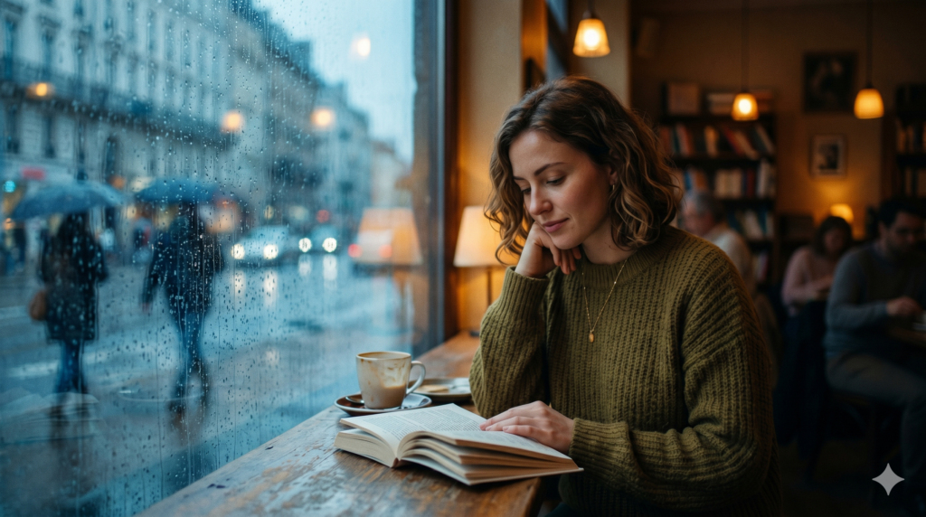
Cinematic still. A woman reading a book by a rain-streaked window in a cozy cafe. Warm amber interior light, cold blue-grey outside. Film grain texture, shallow depth of field, editorial photography mood. No text. Aspect ratio 16:9.
The Analysis
GPT IMAGE 2
Dark, moody, intimate. The amber-blue contrast is strong and deliberate. The background blur (bokeh) from the rain-streaked window is excellent. Film grain is visible. The woman’s expression — contemplative, slightly melancholic — matches “cinematic” perfectly. Heavier, more dramatic tone overall.
NANO BANANA 2
Brighter, more Parisian. The warm-cold light contrast is present but handled differently — the exterior is blue-grey, the interior amber, but more balanced rather than dramatic. The depth of field is shallower (bookshelves visible in background). The woman’s expression is lighter, more serene. Feels like editorial travel photography.
Verdict:
This is the most subjective round and both are genuinely impressive. GPT Image 2 went darker and more cinematic. Nano Banana 2 went softer and more editorial. Which wins depends entirely on your brand’s emotional register — dark drama vs warm elegance.
The Routing Guide — Use This to Pick Your Model
After five rounds, the clear pattern is this: GPT Image 2 interprets prompts as creative briefs and makes editorial decisions. Nano Banana 2 executes prompts more literally. Neither is better — they’re optimized for different working styles.
| Use Case | GPT Image 2 | Nano Banana 2 |
|---|
| Marketing text / posters | ✓ Typography-first | ✓ Graphic design–first |
| Product mockup (shape faithful) | Interprets freely | ✓ Closer to spec |
| Strict composition (flat lay) | Adds creative direction | ✓ Follows brief literally |
| Dense infographic / labels | ✓ More detail + copy | ✓ Cleaner / flatter style |
| Cinematic / dramatic mood | ✓ Heavier, more film-like | ✓ Softer, more editorial |
| In-browser image editing | Not natively | ✓ Gemini in Chrome |
| Price | Free (ChatGPT) / $5/$30 API | Free (Google account) |
🔖 THE ONE-SENTENCE GUIDE — BOOKMARK THIS
Use GPT Image 2 when you want the model to make creative decisions, add editorial detail, and treat your prompt as a creative brief rather than a spec sheet.
Use Nano Banana 2 when you need precise composition control, want your instructions followed literally, or need in-browser editing via Gemini in Chrome.
The smartest workflow: Generate from both, pick the one that fits. They’re both free at the consumer level — there’s no reason to be loyal to one.
Which one are you defaulting to? And which round surprised you most? Drop it in the comments.